

Beyond dashboards
Three real apps built on Keboola with Kai — a travel-timing map, a flight-network simulator, and a personal color analyzer — to spark ideas for your own.
Apps go far beyond dashboards. These three were built with Kai during Keboola’s internal app competition — each turns real data into something interactive and genuinely useful. And they were built the same way you’d build an everyday internal tool: describe what you want to Kai, on top of your Storage data. Use them to spark ideas for your own.
The links below open real, running apps that sleep when idle — the first load may take a few seconds to wake.
Seasonal — when and where to travel
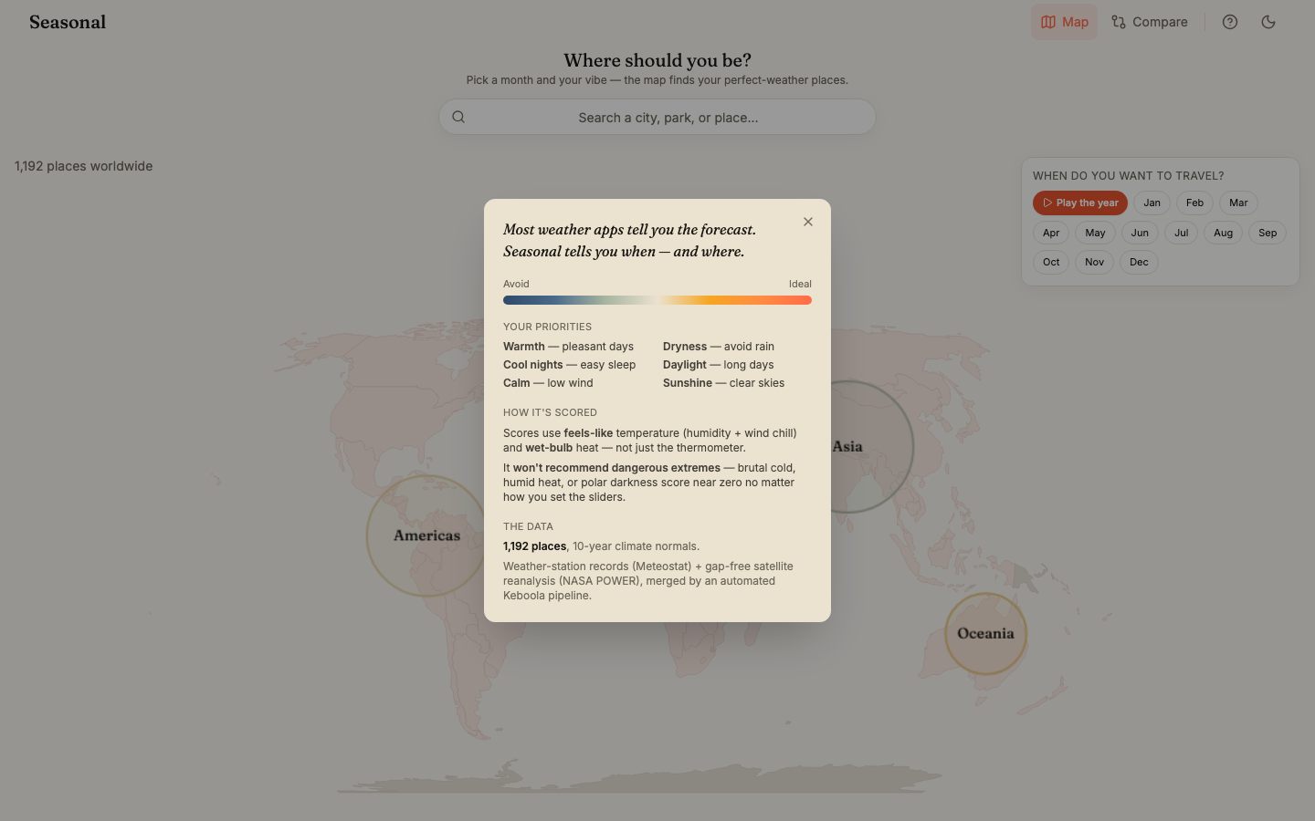
Section titled “Seasonal — when and where to travel”Pick a month and dial in what you care about — warmth, dryness, cool nights, long daylight, calm winds, and sunshine — and Seasonal scores 1,192 destinations worldwide to find where the weather actually fits you, and when. Scores are based on feels-like temperature (humidity and wind chill) and wet-bulb heat rather than the raw thermometer, and the app deliberately refuses to recommend dangerous extremes — brutal cold, humid heat, or polar darkness score near zero however you set the sliders. Play the whole year as an animation (warm = ideal, cool = avoid), switch to a Compare view for destinations side by side, drill the map from continent to country to city, share a place as an image, and jump straight to Google Flights.
Why it’s worth a look: it turns a dry weather dataset into a genuinely useful decision tool — a real consumer product, not a report.
- Live app: https://seasonal-74013643.hub.europe-west3.gcp.keboola.com/
- Data: 10-year climate normals from Meteostat weather-station records and NASA POWER satellite reanalysis, merged by an automated Keboola pipeline.
- Built by Maxmilian Ottomansky.
Global Flight Shockwave Simulator — if a hub stops
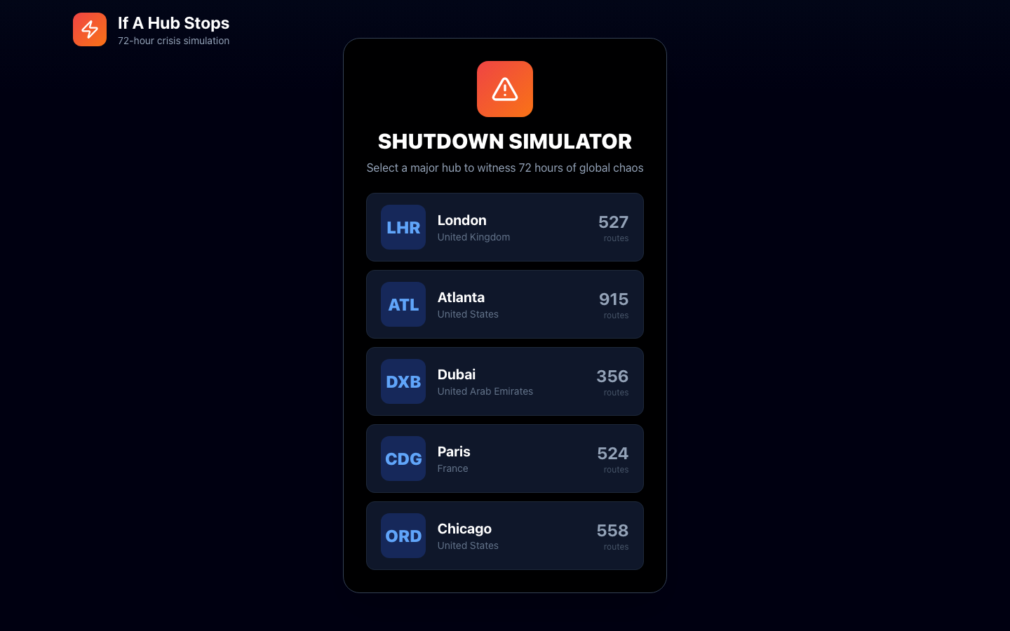
Section titled “Global Flight Shockwave Simulator — if a hub stops”Pick a major airport hub — London Heathrow (527 routes), Atlanta (915), Dubai (356), Paris CDG (524), or Chicago O’Hare (558) — and watch a 72-hour animated simulation of how shutting it down cascades through the global flight network. Framed as “If a hub stops”, it turns a routes dataset into an immersive, cinematic crisis story — a dark, graphics-forward take on network data rather than a chart, with an optional voiceover narrating the fallout.
Why it’s worth a look: it shows an app can be an immersive, animated simulation — not just charts.
- Live app: https://flight-shockwave-1304626299.hub.keboola.com/
- Built by Michaela Zajacova.
Color Season Analyzer — understanding your palette
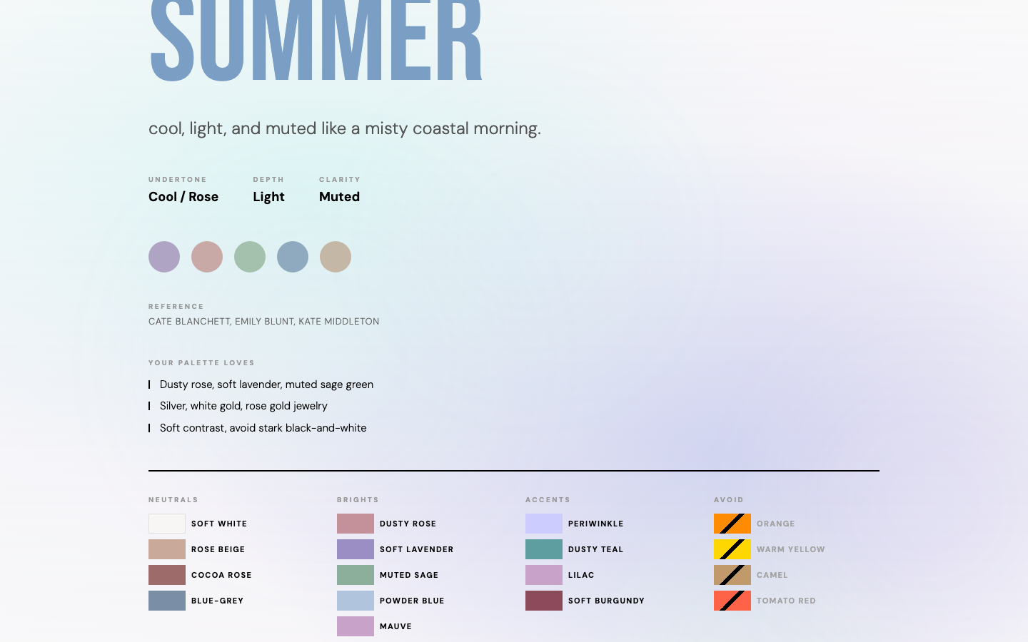
Section titled “Color Season Analyzer — understanding your palette”An editorial, scrollytelling guide to personal color analysis (“scroll to explore”). It opens with the history and science — Johannes Itten’s color studies at the Bauhaus, Carole Jackson’s 1980s Color Me Beautiful, and today’s four-season framework — then breaks down each season in turn. For Summer, for example, it lays out the undertone (cool/rose), depth (light) and clarity (muted), a swatch set, celebrity references, and full curated palettes: neutrals, brights, accents, and the colors to avoid. A soft, designed, consumer-grade experience.
Why it’s worth a look: a personal, consumer-grade app built on the very same platform as your team’s dashboards.
- Live app: https://color-season-analyzer-43672911.hub.us-east4.gcp.keboola.com/
- Built by Andrea Nováková.
Build your own
Section titled “Build your own”Ready to try? Start with Getting started, or jump straight to Build with Kai.